Recently when I was perusing the interwebs, I came across a great example of that old thing called ‘same same – but different’
This example of which I speak is the boutique showroom of the clever LA based design duo Woodson & Rummerfield. They think of their retail boutique as the most stylish house on the block. Having had a look through photographs of their showroom, I wouldn’t doubt that it is just that!
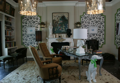
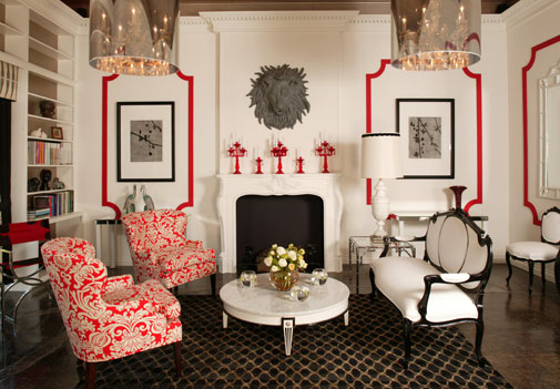
So then, same same- but different… The W&R showroom is a great example of how the same space can be completely transformed into a different space by changing the furniture, colour schemes & wot not!
See:
The first image is a room setting furnished with beautiful Florence Broadhurst fabrics & wallpaper (side note: the fabric on the ottoman is so fabulously gorgeous & a current obsession of mine – I am busting to use it somewhere!)
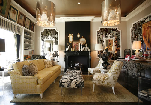
So, same room, same furniture layout but different wot nots. Looks quite different to the room above though -yes?!
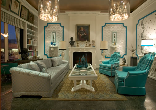
& repeat……
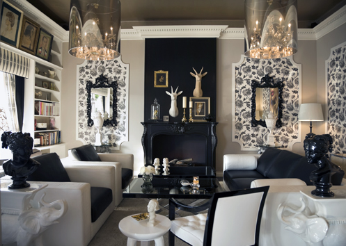
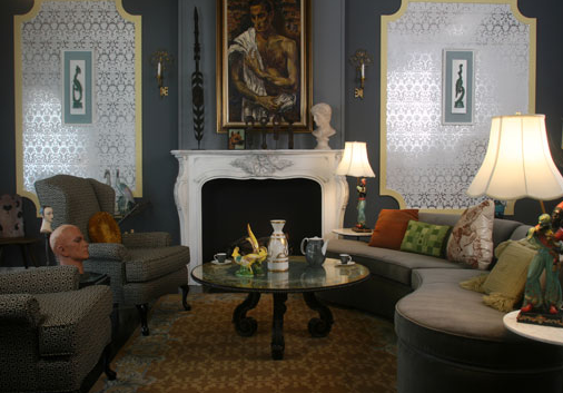
Whoops! The repeat function got a bit stuck!
OK, so granted the above are still all in a similar design atheistic, but I think you can understand the point of which I make!
All pictures via Woodson & Rummerfield’s house of Design
