Recently I blogged about a chair makeover I undertook for an apartment project that I’ve been working on -a refresher on that here.
Taking advantage of my lovely photographer & friend Jacquie Melville’s flying visit back to my Melbourne town, (she moved to London on me – honestly how bloody rude!) I wanted to get a few projects properly photographed to update my website. And so I did!
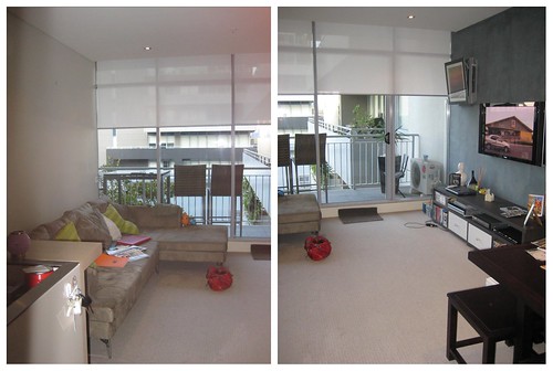
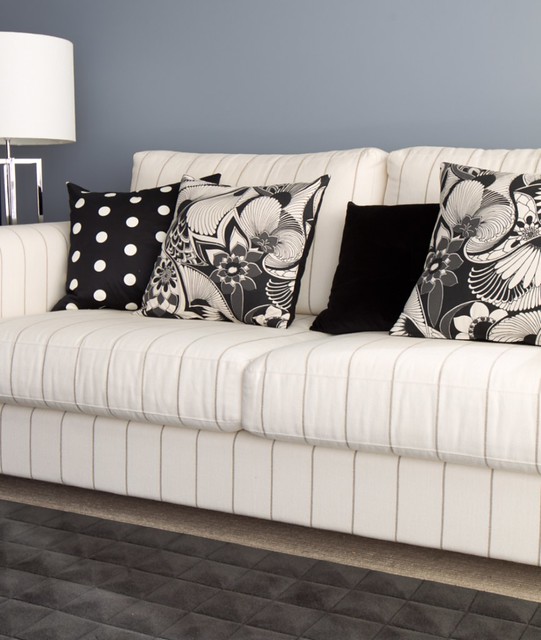
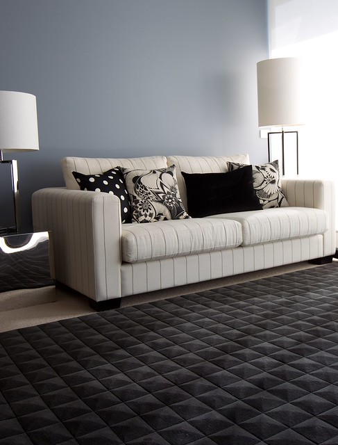
I always find it interesting seeing before & after pictures of interior spaces – gives a great visual of just what a difference something like a paint colour makes! The before colour in this apartment was a blah nothing colour, and used on both the walls and ceiling. Eh. A feature wall in a concrete finish had been added, but still the space was bland with no soul or warmth to it. The existing furniture also wasn’t a good fit – literally. the sofa was too large for the wall it was placed on, so we re-homed most of it & set about creating a smart and sophisticated interior.
So… on with the pictures!
I really hope it’s obvious to you which are the before shots & which are the after! But just in case its not, I have labelled to save you the awkward moment!
Before…
And After
Still after…
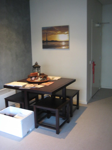
Dining table before…
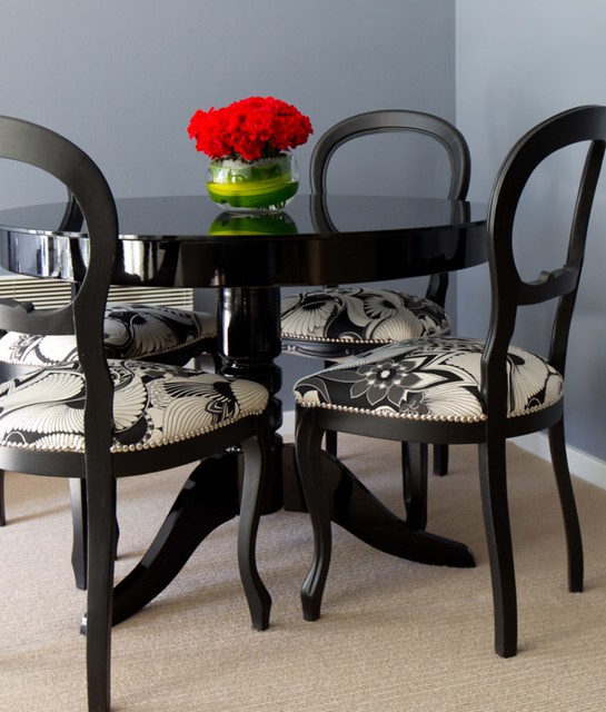
Dining table after & featuring the chairs
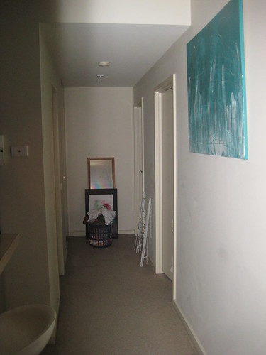
Hallway before…
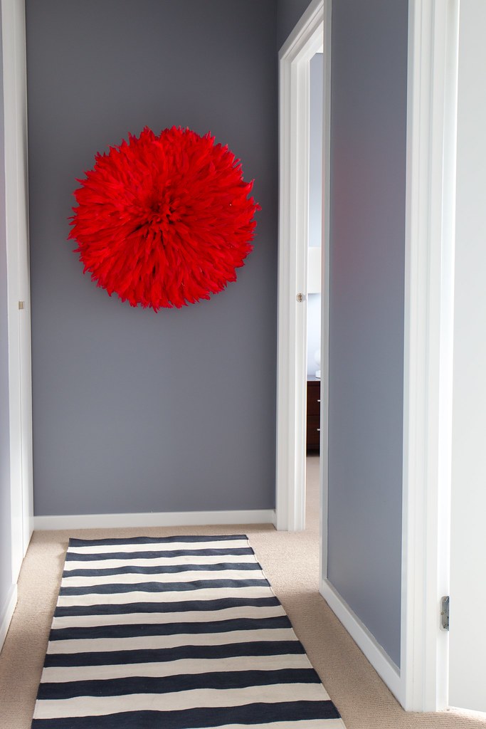
Hallway after (OK yes. that is my Ju-ju)
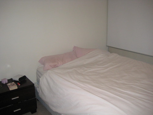
Bedroom before…
No. Not a whole lotta lovin in this room!
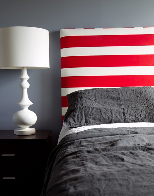
And After.
And yes mum, the sheets are meant to be crumpled like that: they are pure divine linen loveliness!
And there you have it!
I will have another before & after of a bathroom reno soon.

