Say WHAT?!
Thats right!
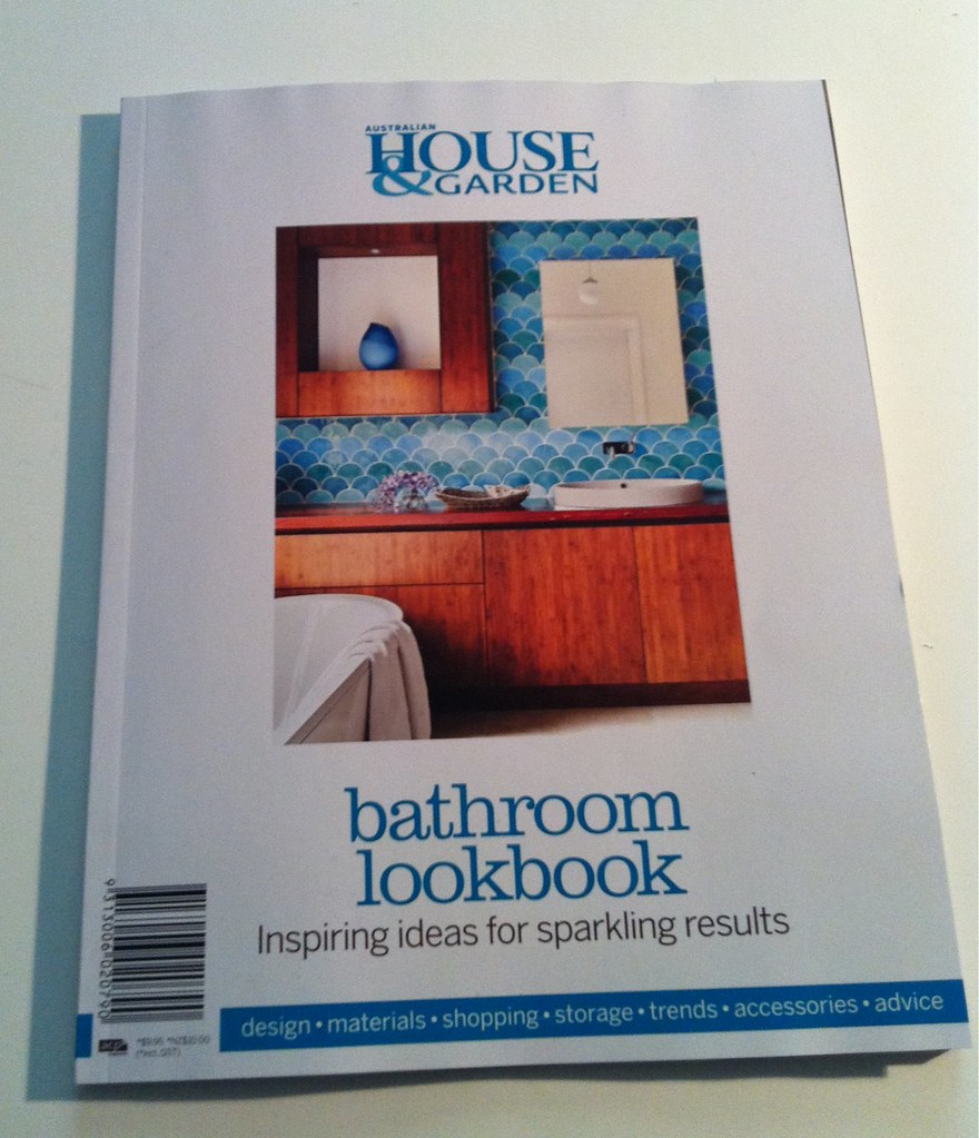
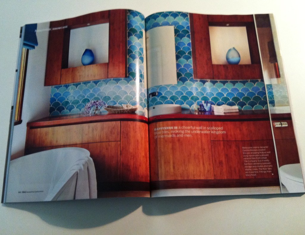
That IS my project on the COVER of the new House & Garden Bathroom lookbook! and then some more on the inside!
and in case you thought I was fibbing, thats my name just there. SEE!!
Photography by Armelle Habib who did an amazing job!
Look see here if you would like to see some more of that project – before & afters.
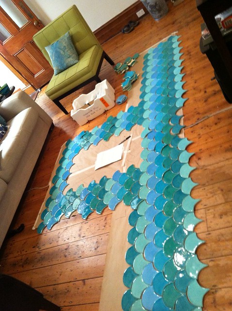
A lovely person over on my facebook page (ahem… go like me, um it!!) commented that she was glad she didnt have to do the layout of the tiles! It was a bit fiddly & different than a usual tile layout, so I thought I would share some of the pictures I took while working it out!
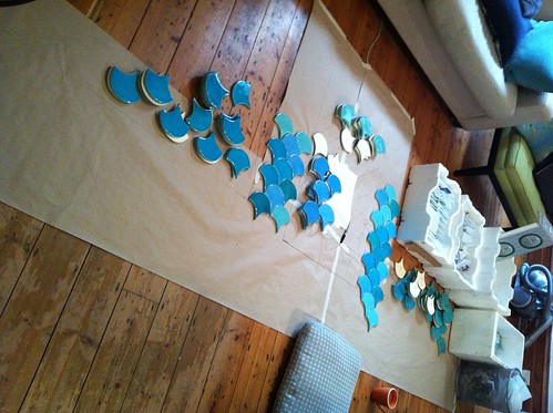
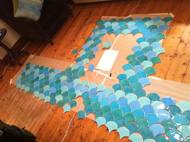
Originally the plan was to place these tiles in an organised random pattern. I admit, there was some procrastination on my part when it came to working out this organised chaos! I’m sure a computer program would’ve been simpler, but I am a bit old school and like to draw things out, so I made a life sized template on my living room floor & started to play! (cant accuse me of not being hands on!!)
Starting to get a feel for the layout… this picture shows half most of layout as random, and starting to play with graduating colour stripe layout.
I feel hard in love with the graduated stripe. It meant we had to order a few more tiles & delay the install a week while they were hand made! But I think it was well worth waiting on.
See, it HAD to be striped.
I had the easy part! Bruce the tiler had a very difficult job but did it beautifully! These tiles are hard enough to keep straight just placed on the floor. I dont want to think about hard it would’ve been adding gravity to the mix!
Anyway, its not quite mid day, but the champagne is cooling ready to celebrate my first ever magazine cover! CHEERS!

