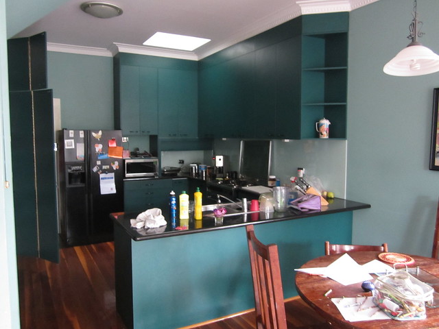
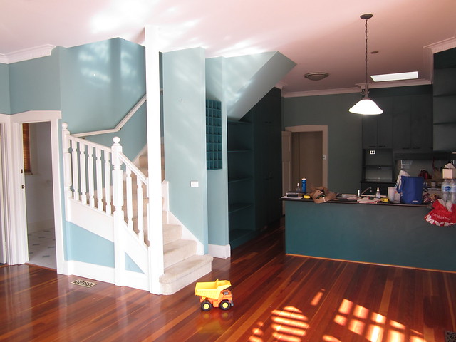
Before and After Melbourne Kitchen Designer Camilla Molders – Its about time to share another before & after dont you think! Well I do, & I think I’ve established Im the boss of this Blog!
Moving on… This project was a classic case of good house gone bad!
The house is a beautiful art deco house found in a Melbourne beach side suburb & was a victim of a 1980’s renovation resulting in a weird cramped, ugly & dark kitchen.
You know the pictures above are before shots right? right?!
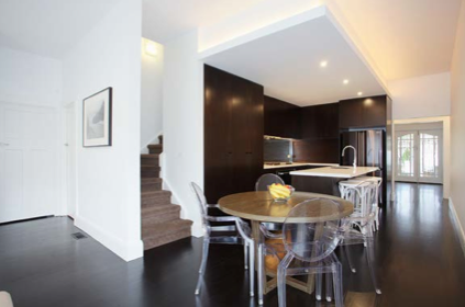
As the house was in need of structural work (it very clearly leaned to one corner – great for indoor skateboarding & Tonka truck playing, but not so much for general living!) we were able to make bigger changes than just cosmetic. The architect on the project had the genius idea of swapping the kitchen over from one side of the room to the other which allowed an entrance to be opened up & a line of sight right through the house (also letting more light in) rather than sticking with the weird rabbit burrow as it was.
True to form – this site shot does include a shot of my hand bag!
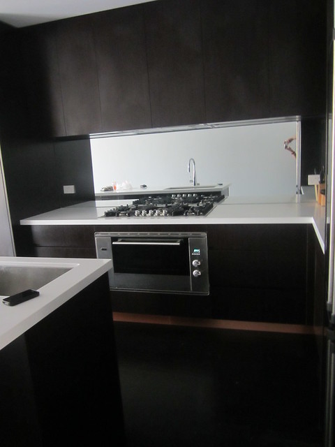
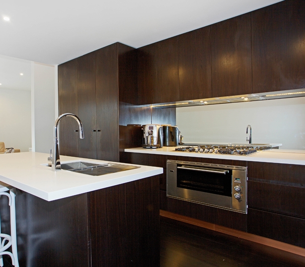
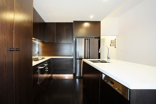
I was quite excited to see the kitchen go in & I was not disappointed. I had designed it to be more like a fixture in the house rather thadiving n a feature. My client was determined to have dark timber floors (so SO beautiful, but a b*#ch to keep clean – stock up on swiffers if you want dark floors!) so we chose a dark timber veneer for the kitchen cabinetry so it was quite seamless.
To bring a little sumpin sumpin & personality to the kitchen design I added a copper kicker.
The contrast of the copper with the dark floor & cabinetry looks quite WOW! (no, I will not say WOW factor! – I ban that saying on my projects!- true story!)
The copper just adds a ‘little special’ & brings such life to the space without overpowering the simplicity.
I loves it. I loves it hard.
Oh & when I say I added – I mean very literally I -being ME! I was the one down on that floor installing it! I can not ever be accused of not being ‘hands on’ on my projects!
And so here is the finished kitchen result:
The picture above is a shot I took – as you can see my hands in the mirrored splash back above!
The following pictures were taken by the builders to showcase their clever handy work! (Once a few more furniture pieces are in, I will get my own pretty pictures taken with non builder eye styling done!!)
And from this angle
Due to one of those real life annoying things – budgets! we are yet to replace the furniture, but will over time.
See the carpet there on the stairs – its Alpaca wool. Ah, so divine! Its hard to resist a little roll around on it! (oh but i did…)
The window furnishings have all been installed & they also made my heart skip a beat! We have put Roman blinds through out & then two large windows in the living room have been dressed with a linen sheer with a simple S Fold heading & block out blinds hiding underneath. The black rod pics up the dark floor & once we have replaced the furniture with gorgeous big linen sofas & gorgeous things – the space will look stunning!
To quote my clients message to me once she saw the window furnishings installed ” I F*****g love them SO much! Thank you, now my house looks like a home!” I think its safe to say she is happy!
Do you think I should use that message as a testimonial on my website?!
And just a snippet of the laundry. Perhaps the prettiest laundry I’ve ever seen!
Still a fair bit to happen on this project, but it is coming together beautifully- it makes me happy!

