I love a good before & after story! Don’t we all? Is it the fairy tale interior design equivalent – ugly room, does good & lives happily ever after?!
Anyway, as I’ve decided to give this ol blog more attention once again, I think a before & after is just the right story to tell!
So I’ll start with a project from the archives – our Highfield road project that we completed back in 2012.
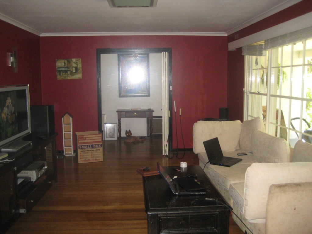
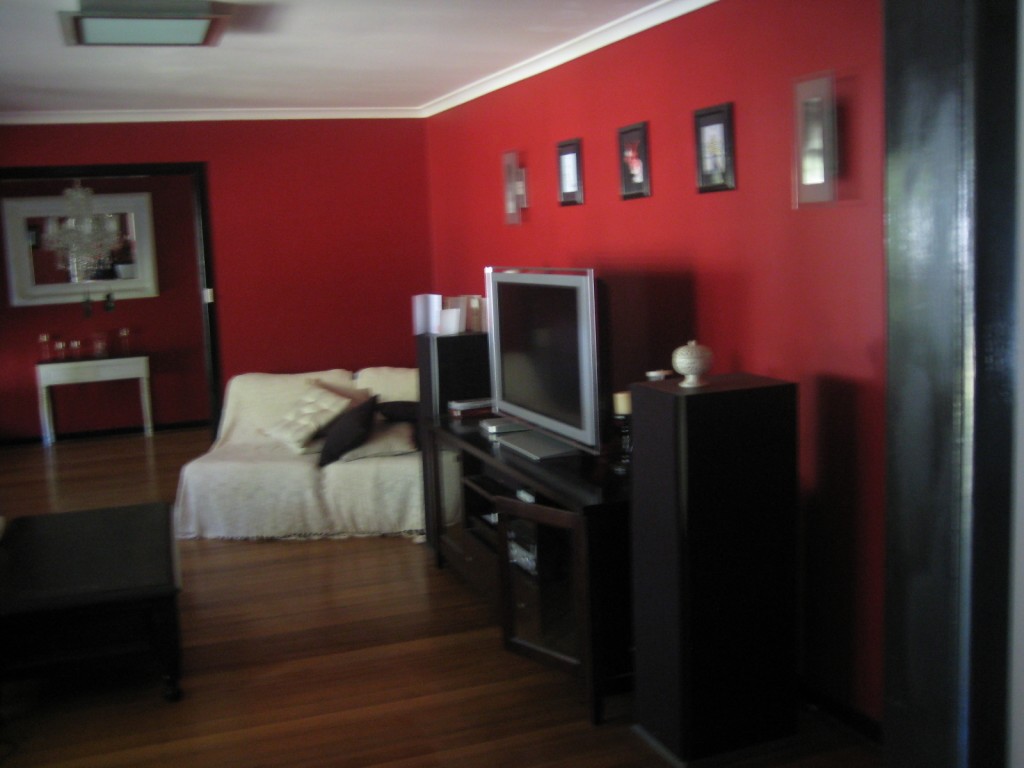
The before was to the previous owners taste & each to their own. However to me it felt like it had been a tame episode of the very 90’s tv decorating show Changing rooms where the coffee table made of car tyres and empty beer bottles was removed prior to sale. My client who purchased this home in its red state felt along the same lines to me & so we got busy…
So lets talk about some of what we did:
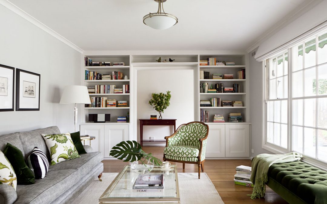
The brief for this sitting room was always about how the client wanted to feel when she was in the space: Fresh, light, bright, airy & relaxing where the descriptive words used. And to be somewhere to sit comfortably & chat with friends. Not a TV room – this was a grown ups retreat away from the teenagers hang elsewhere in the house. This house and this room particularly, had great great bones with its beautiful big picture window & lovely proportions, so all we needed to do was quite decorative.
Painting away the heavy red and gloss black, to a soft light grey used on the walls, and the trims, window frames & ceiling to a clean fresh bright white, immediately changed the feel of this room.
I mean – Paint – WHAT a super hero! With fresh paint, the room already felt light & airy – nailed the brief already!
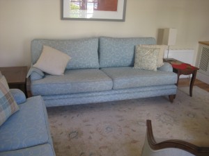
However one does need furniture to sit upon and as our client had only recently purchased quality sofas that were in such great structural condition and a great classic shape, we decided to reupholster rather than start over with new.
Furniture before:
Great shapes, but so bland.
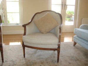
How GOOD the chair looks after! Green & graphic!
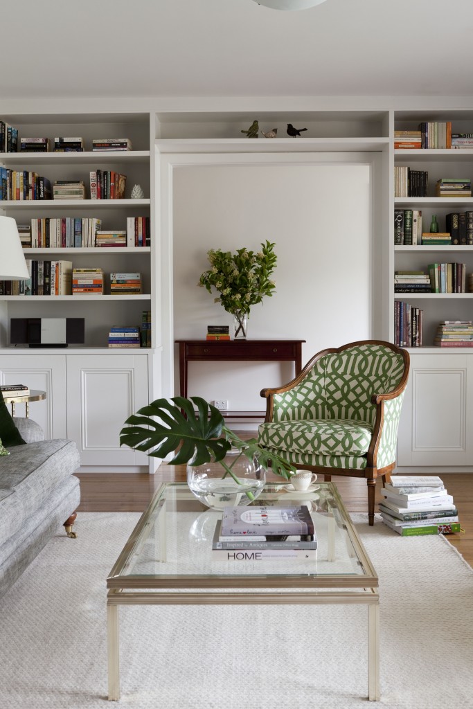
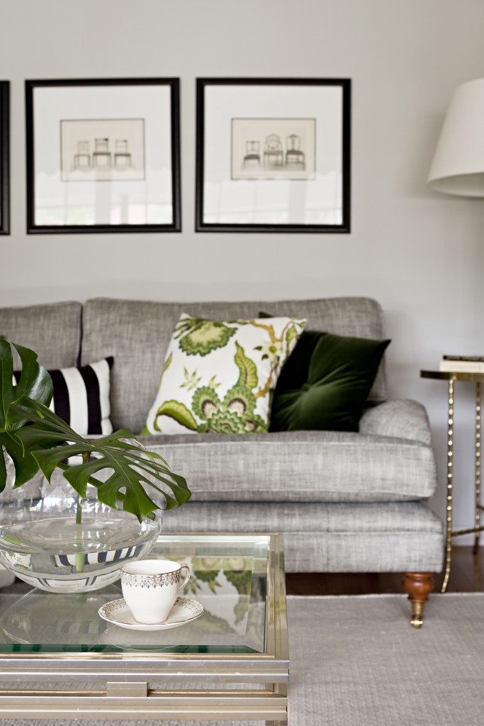
And the sofas were given lovely new life with grey textured upholstery. Great on the eye & sooo great to the touch!
As a true & unashamed fabric addict (out & proud!) I only use predominantly natural fibres for upholstery as it allows the fabric to breathe, which in-turn makes for a more comfortable sitting upon.
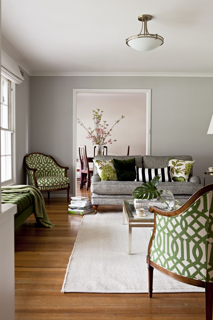
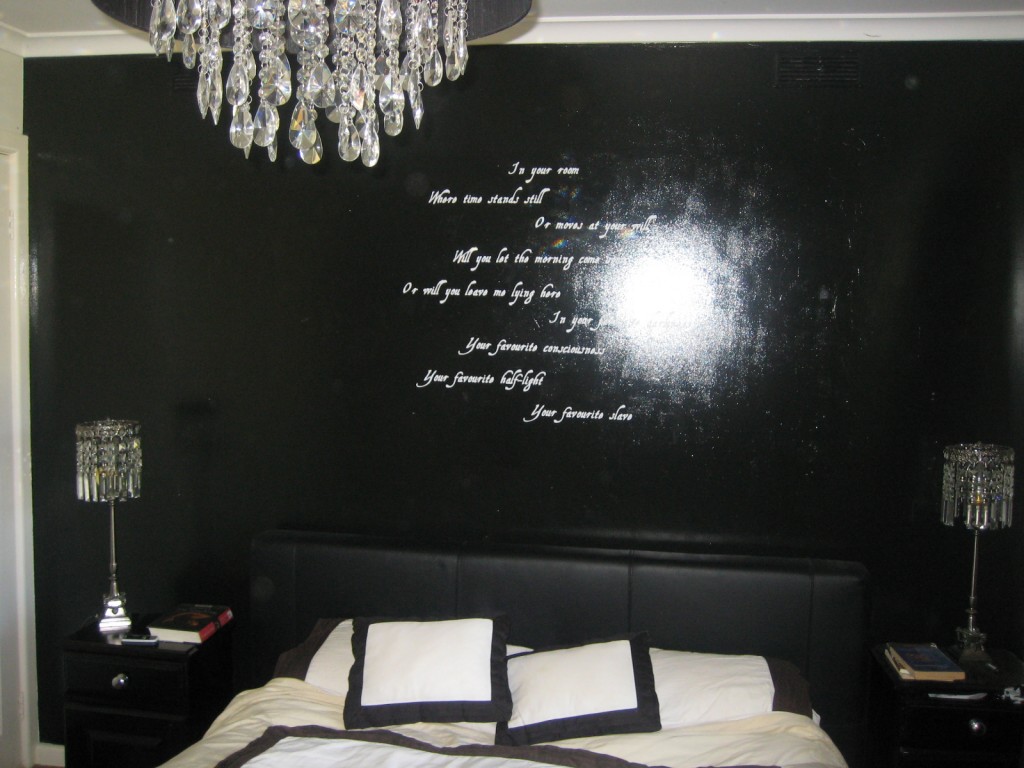
So much more that we did to create the room above : the custom book shelves, velvet ottoman, the ebay score of the coffee table… you can see all above – but I want to move on to the master bedroom with the gloss black feature wall with a poem upon just smacks you in the face. (To me it was a hard slap!) This colour combo was doing nothing for our light, airy fresh brief. (you are feeling the changing rooms reference a little more now -yes?)
BEFORE – most definitely BEFORE.
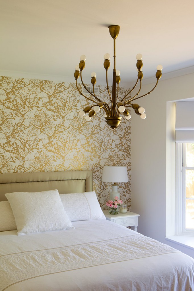
The end result:
A light fresh wallpaper with its gold pattern upon, added a custom bedhead that we had made in a light gold silk sateen fabric set a restful tone.
We added a bit of wow zing with a vintage light that we sourced and the end result is simple, fresh and classic!

This project we completed back in 2012 and one of our most popular projects on Houzz with over 70,000 shares!
More on our website here

