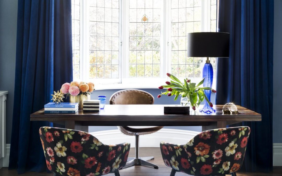
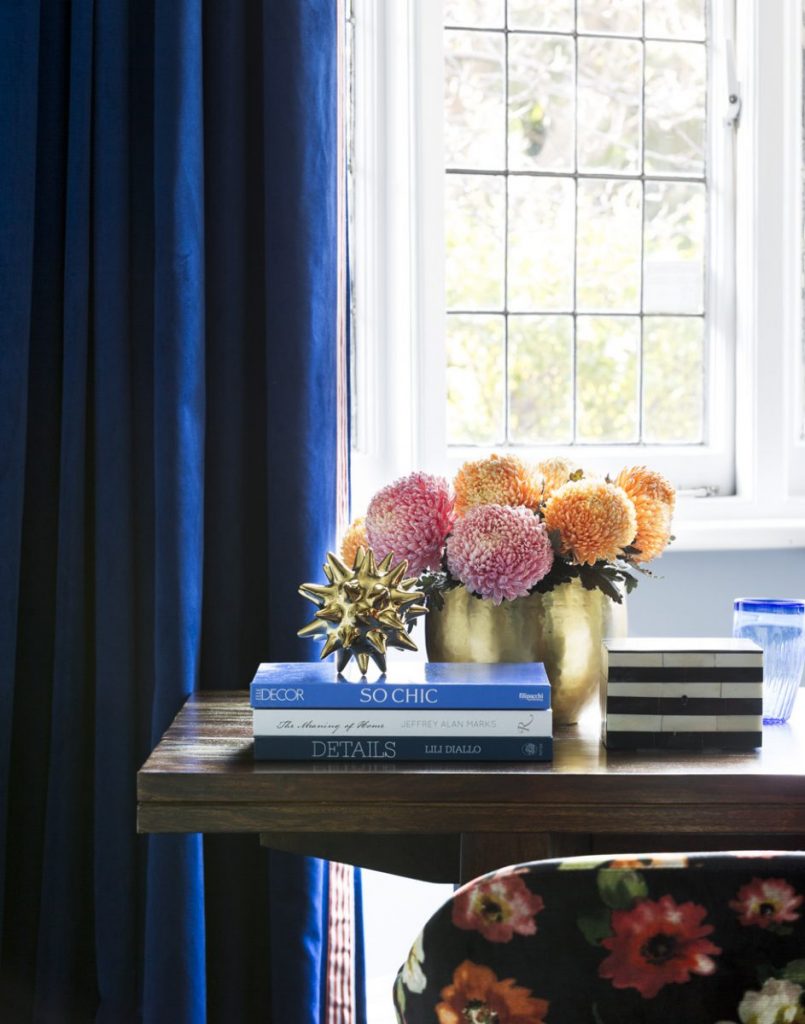
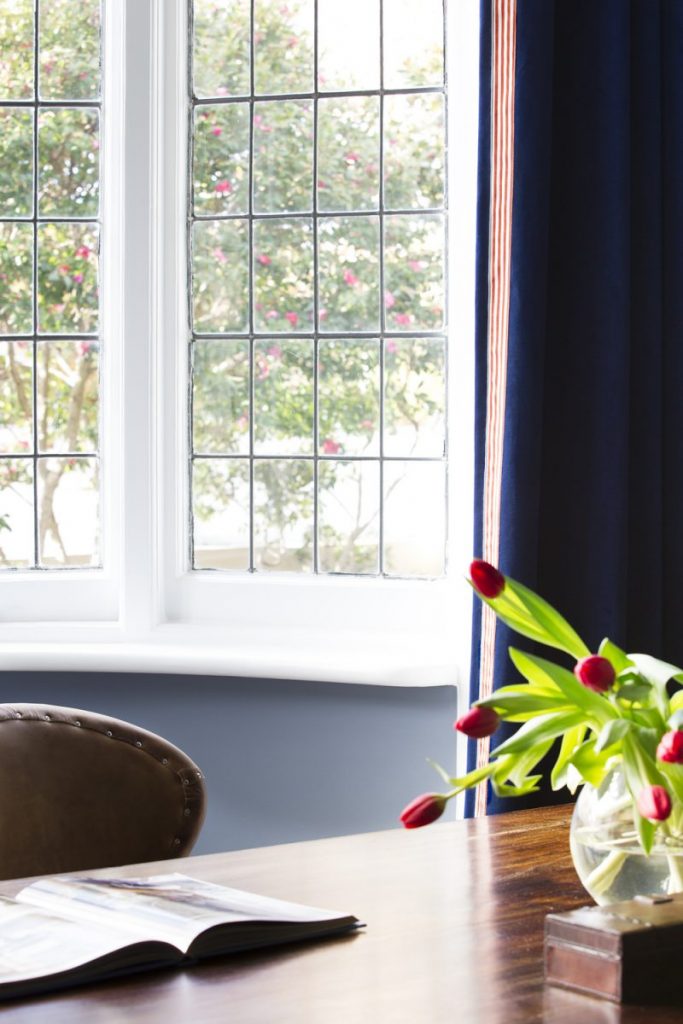
We are thrilled to have our textilicious study from our Brighton project included in this years Australian House & Garden Magazines top 50 rooms issue.
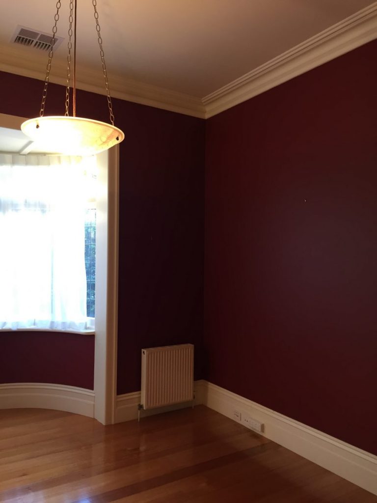
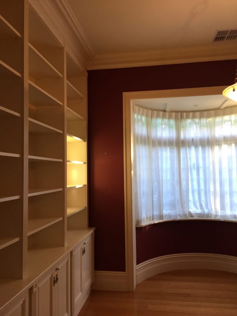
We gave this room a decorative facelift, so to set the scene, following are a few of the before pictures of what the room looked like before we got our hands upon…
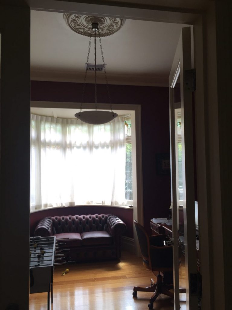
BEFORE
As you can see it is a room with such lovely bones. They just don’t make them like that anymore (and sadly too many are getting bulldozed making room for a whole lot of average…)
The beautiful bay window was covered hiding the original lead light detailing behind a sheer curtain. And the deep burgundy and cream colour scheme was just too heavy for the space (not to mention hello1990!) and certainly didn’t reflect the vibrance of the lovely family who live within, so had to go!
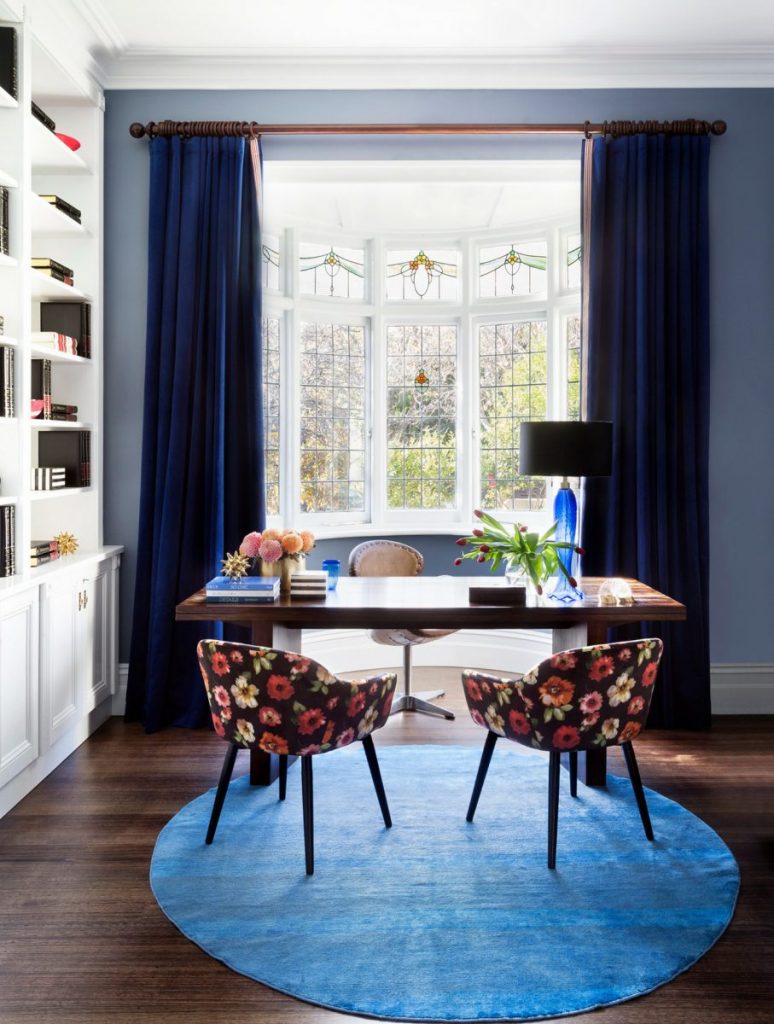
The brief for this project was to create an interior with a bohemian and eclectic feel. To achieve this, we used layers of beautiful textiles, patterns and colours to create a design that is fresh, cool & much more representative of the vibrant lovely family who live within.
Im confident we nailed that brief!
So, what did we do:
- Sanded & re stained the floors. The floors had yellowed over the years and turned to a nasty orange tone. We sanded & stained them to a deeper walnut colour that recedes allowing everything else to be more prominent.
- Repainted – using a clean fresh and bright white colour for all the trims and bookshelves, and a calm receding blue for the walls. Seeing the burgundy be gone was a sigh of relief all round!
- New window furnishings -We opted to not cover the lovely lead light detailing in the bay window, so opted for drapes outside of the window. We selected a rich blue velvet that drapes beautifully and has a lush touch! A contrast trim to the leading curtain edge is a nice little detail that brings the whole rooms colour scheme together.
- Worked with a local furniture designer to customise the chair design & upholstered using a big and bold fabric design
- Used the clients existing timber desk and Timothy Oulton desk chair
We are thrilled with the end result! A light, inviting room that is much more a reflection of the people who live within!
See more of the other rooms included in this years House & Garden top 50 rooms here . You can also vote on your fav & win sweet prizes!

