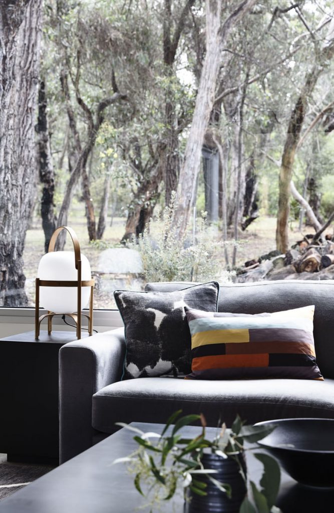
Cushions – the hero of a well dressed interior!
So here I am again, talking more the important things in life – like todays topic – cushions!
To some it/they are a useless thing in the way & thrown on the floor or seen as “fluff” as I once heard one architect who proudly displayed a project featuring a concrete sofa refer to it/them as! hmm. inviting…
I for one, bloody love a cushion.
I regularly see what a difference a cushion can make to a room when its added. I see how a cushion can immediately change the whole feel of a space and make a space into a home, add character and personality, tie a whole rooms design scheme together and be something that is comforting and comfortable. What a hero!
A cushion is an easy way to go a little wild with colour and or pattern without too much commitment – ideal for those commitment-phobes out there… or also fabric – addicts like me who like to have a lot of different cushion on rotation (sometimes Im in a silk velvet mood – sometimes pattern…. eh, I’m fickle – don’t judge me!)
It will come as no shock that I have opinions on this matter – So first up, lets talk the do’s & dont’s.
- Cheap Dacron inserts that you can buy from craft stores are a hell no as far as Im concerned. They might look semi decent for 1 week or 2, but after that they are pancake flat as they dont bounce back & look terrible, & then inevitably end up being added to the rubbish pile – which I consider to be irresponsible purchasing in the first place.
- Cushions placed on the diamond are also a solid no. They work fine that way in Indonesian resorts where its charming – but that is the exception!
- Use good fabric: A nasty synthetic fabric is not a cushion I want to snuggle up with when Im binge watching some high brow netflix program (it happens!) I think about the textures I want to feel. (which explains the French linen & the silk velvet I currently have on sofa rotation!)
- Cushions are also where we can spurge on amazing & expensive fabric that would break the budget elsewhere as they take less meterage to make.
- Like most things, cushions are not created equally – which is why we have ours made for our projects so we can select the exact colour, dimension, where exactly the pattern placement features – and what the inner is. And for the record I am a feather fibre inner kinda girl – gives the firmness I want, with a soft look that doesn’t require the constant maintenance that a full feather does.
Enough of the words & on with the pictures… of well, our projects where the cushions have their hero moments!
First up – the details:
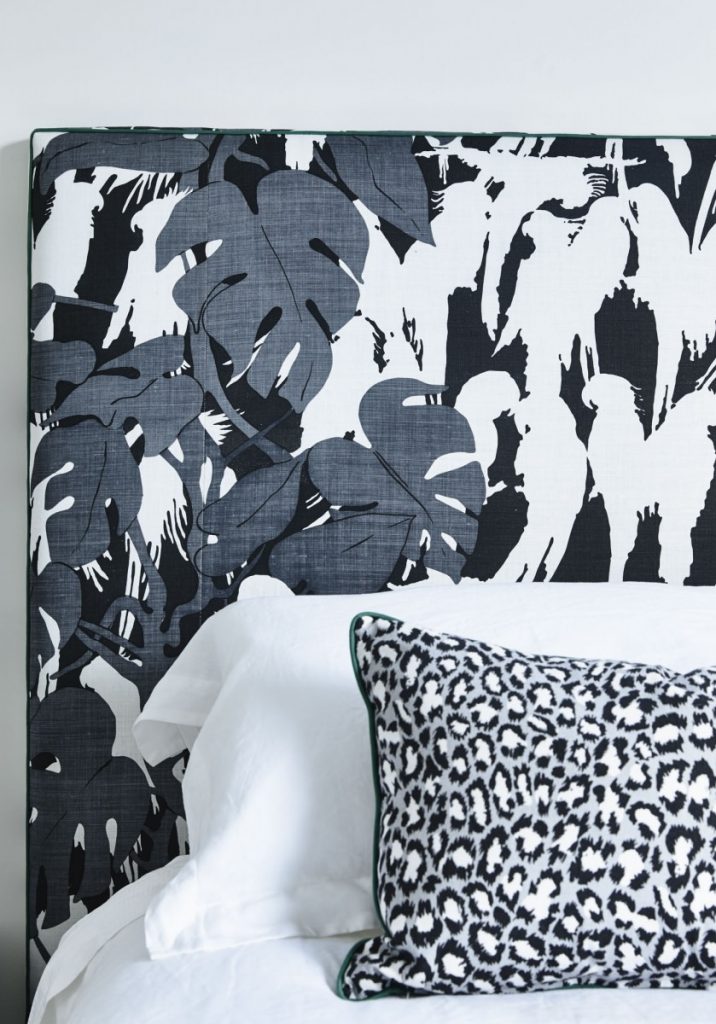
So over in the guest room in our Aireys Inlet beach bush project -firstly – a little back story… This is a room with limited window views (due to the one & only neighbour & this rooms outlook onto their house) In a house that is all about gorgeous bush views, and this room being the one room in the house without any – we opted for a patterned fabric as the bedhead that is quite reminiscent of the views in the other rooms! being birds on trees…
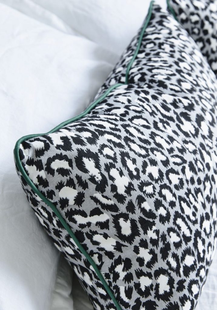
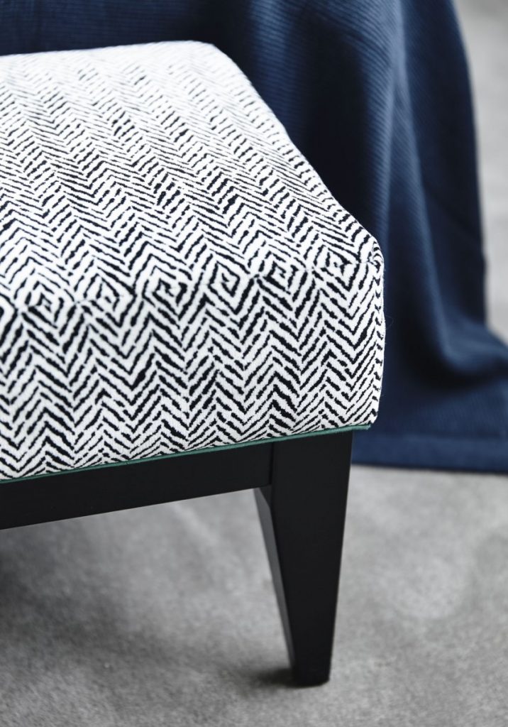
Cushions are a great place to inject beautiful & clever detailing. Like colour, or texture & a bit of in a fringed edge or the like. These details that can get a little lost in photography unfortunately, But when you are in the space they reveal themselves and add to the dressed ‘feel’ of the room. So here, we added a deep green piping pop as a contrast to the black & white patterns on the bedhead, cushions and the ottoman at the base of the bed. Subtle, but when you are in the space its a nice little touch that gives subtle feels!
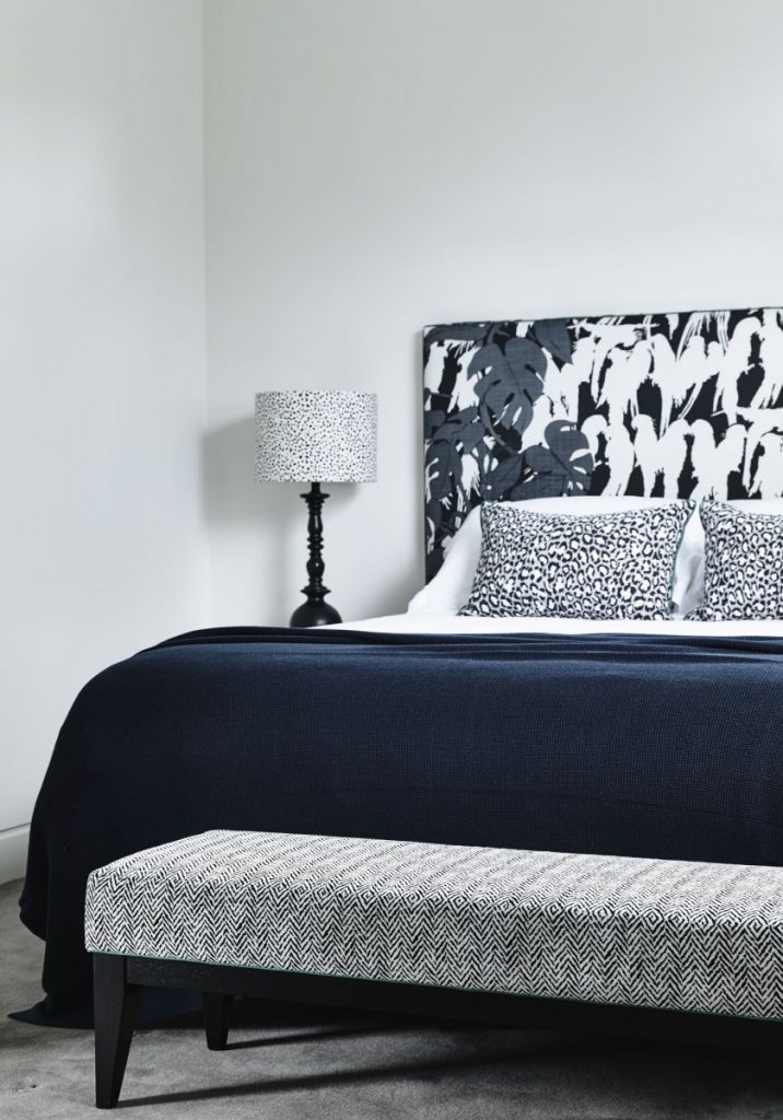
So obviously this is not a cushion… (but a lovely pic of the bed base ottoman with the piping detail. – shown here – just because!)
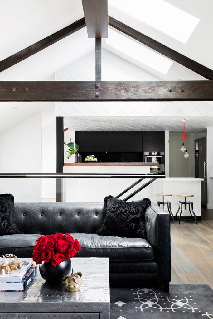
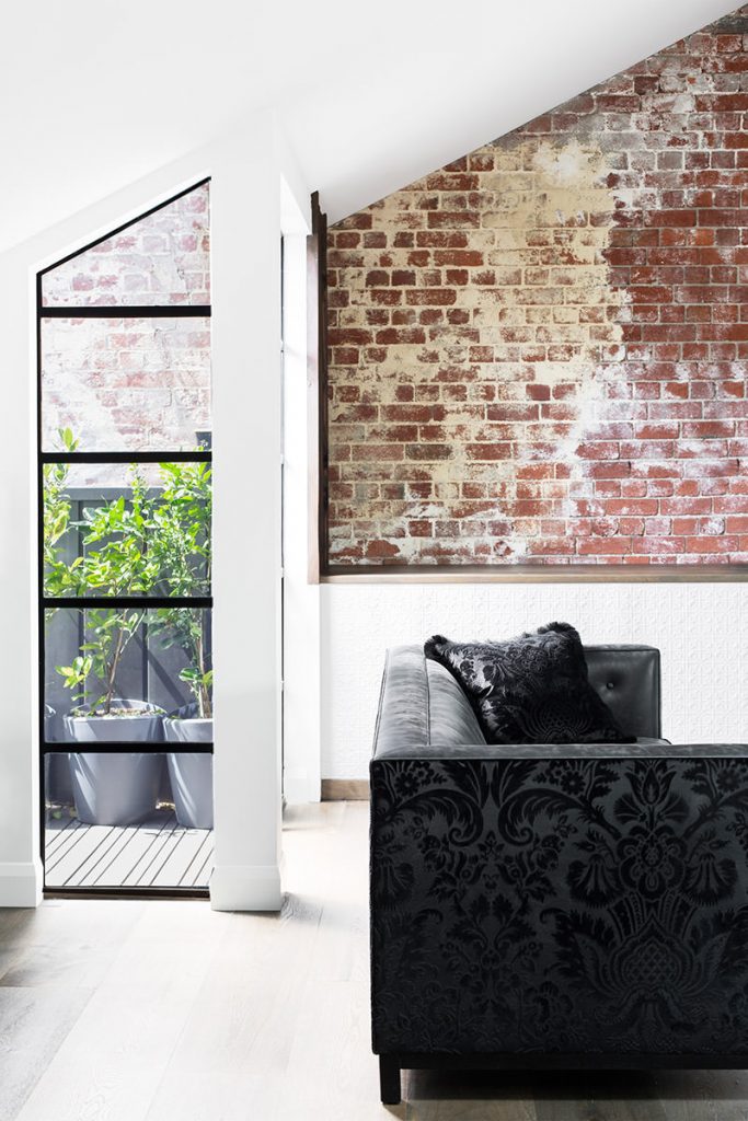
Over in our Middle Park warehouse – With so much going on within architecturally -like the pressed tin detailing, exposed bricks & overall amazing building etc – we were quite careful with how we used pattern in this space.
The living area is on the second level and the stairwell is located in the centre of the room (you can see the glass balustrade behind the sofa in the image below) Being a glass balustrade, we designed the sofas to be as sexy time on the back as on the front. However the patterned damask as an all over on 2 sofas would be just too OTT. So to tie it all together, the same fabric as on the rear of the sofa was used for the cushion with the detail of fringing for a bit of glam!
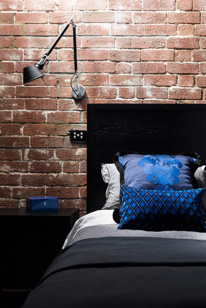
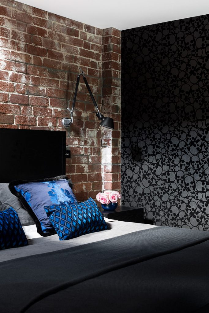
Meanwhile downstairs in the bedroom, the colour in this room is all in the cushions – vibrant blues & textures & a little more of the fringing!
ok, I included this bedroom picture more to show the wallpaper than another cushion angle. but um – COOL!
Details, details, details – As I mentioned somewhere above, a lot of details get lost in photography.
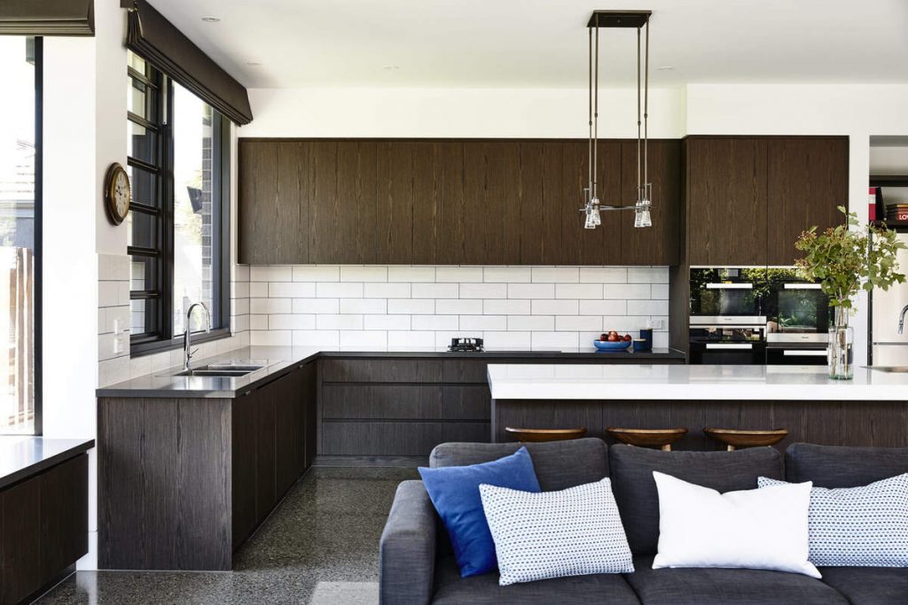
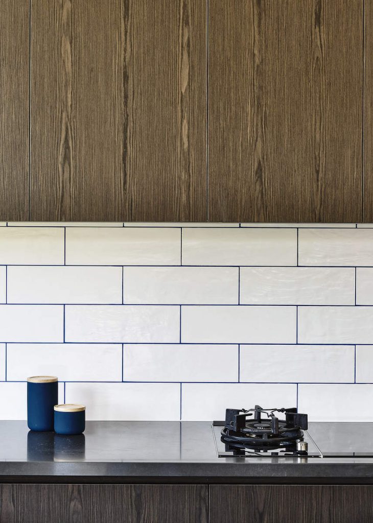
In our Kew house – For what is actually quite a subtle detail pop of something something, we used an electric blue coloured grout in the splash back and tied it into the whole living area together by using the same colour on the rug as well as on the scatter cushions – in both plain blue, and in details on the white cushions pictured.
Electric blue grout – just not as OTT as it sounds!
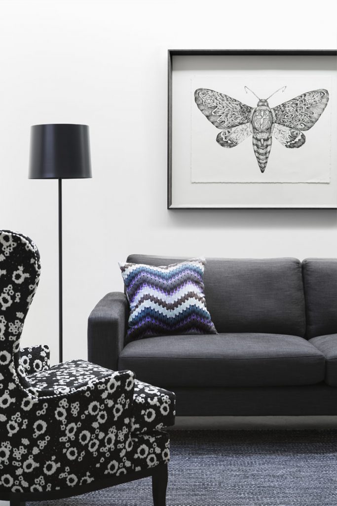
I do like to inject a bit of humour into our design schemes where we can…cushions are an easy way to do so! In the living room of our Prahran flower house our lovely client had commissioned an artist to create a very personalised art piece for her family which is a beautiful drawing of a moth with symbols representing her family within the image – I love that!
So it was fitting that we used a brilliant fabric for the scatter cushions that is a pattern made entirely of moths! not real moths obviously – printed fabric! Its very cool! You can see more of that fabric here
Back at our Aireys Bush Beach house, another little subtle humour move, was to use a pattern on the cushion that is reminiscent of the stacked stone on the fireplace.
see it? Get it?!
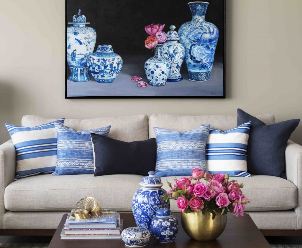
Balance is also key in any interior scheme (and a good idea for life in general too!) In our East Brighton house where the painting we commissioned is the centre piece, we used horizontal stripes as the pattern- that go easy on the eye, accompanied by some solid navy linen cushions that balance the scheme with their colour depth.
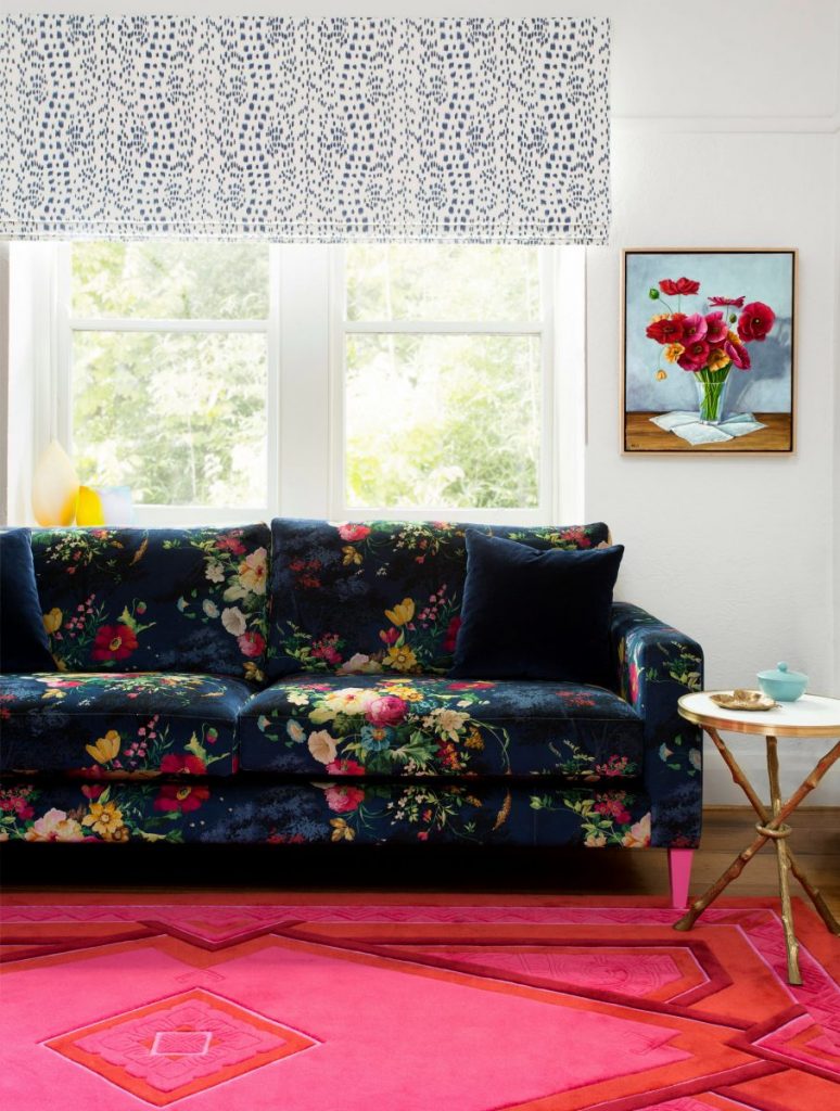
Now as there is ALOT of pattern in the upholstery, rug & blind in the sitting room of our Prahran Flowerhouse, we used a plain velvet to calm all the pattern & balance & ground the room.
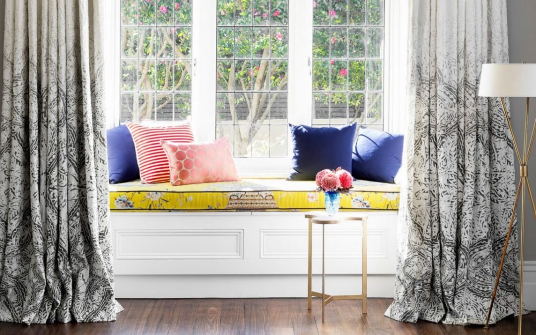
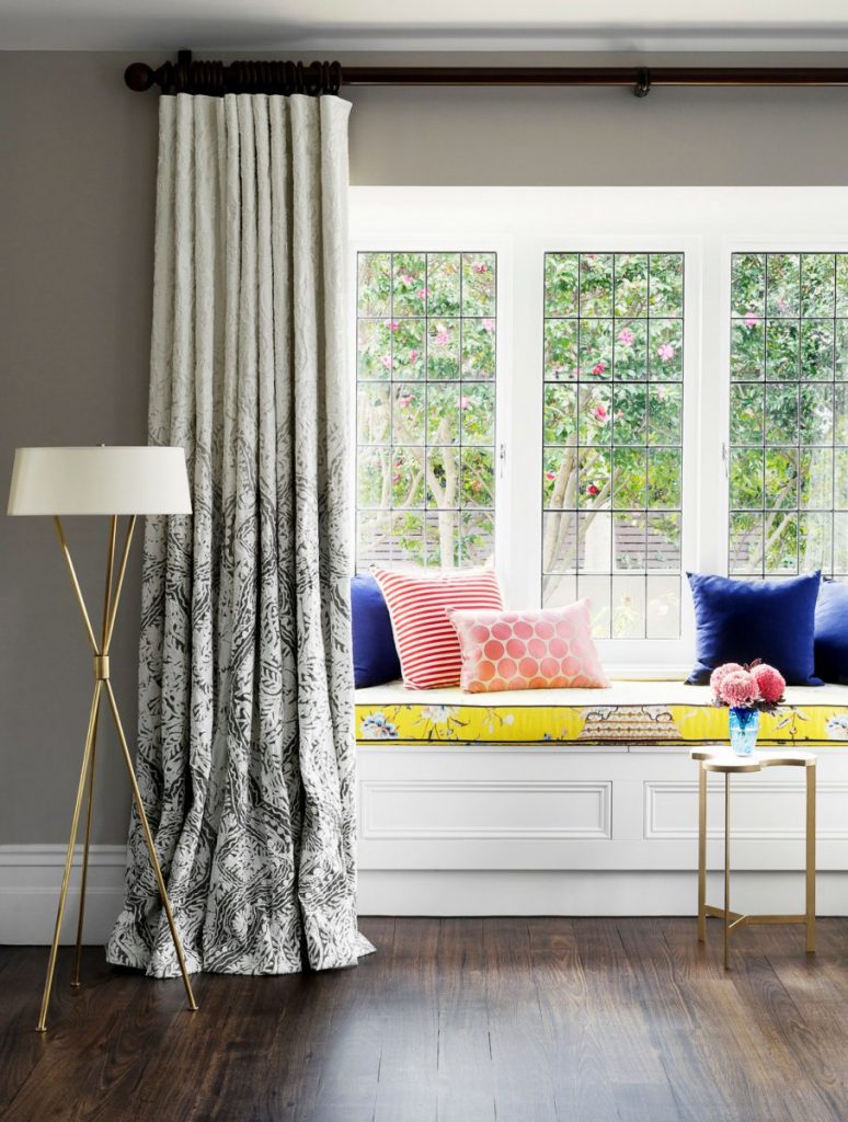
Now in our Brighton house – As there is a lot of pattern in the curtain fabric and window seat also both light colourways, we used some plain navy (once again!) to anchor all the lightness and tie the scheme together. I felt the depth of colour was necessary to balance all the lightness.
oh, & then we threw in some more pretties too. just because!
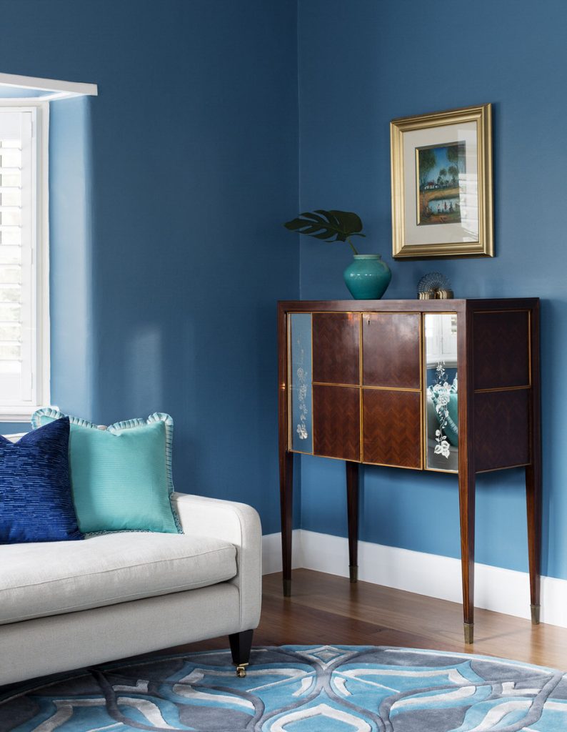
Over in the sitting room of our Kew Blue house, we used the same bright blue velvet for the cushions on the sofa, as we did for the dining chairs in the adjoining dining room.
These velvet numbers teamed with a couple of turquoise silk scatters with a cool ombre flanged edge where the colour flow that was used to connect the two adjoining rooms.
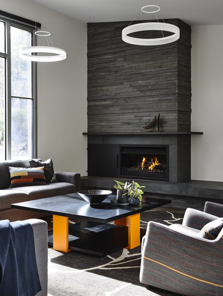
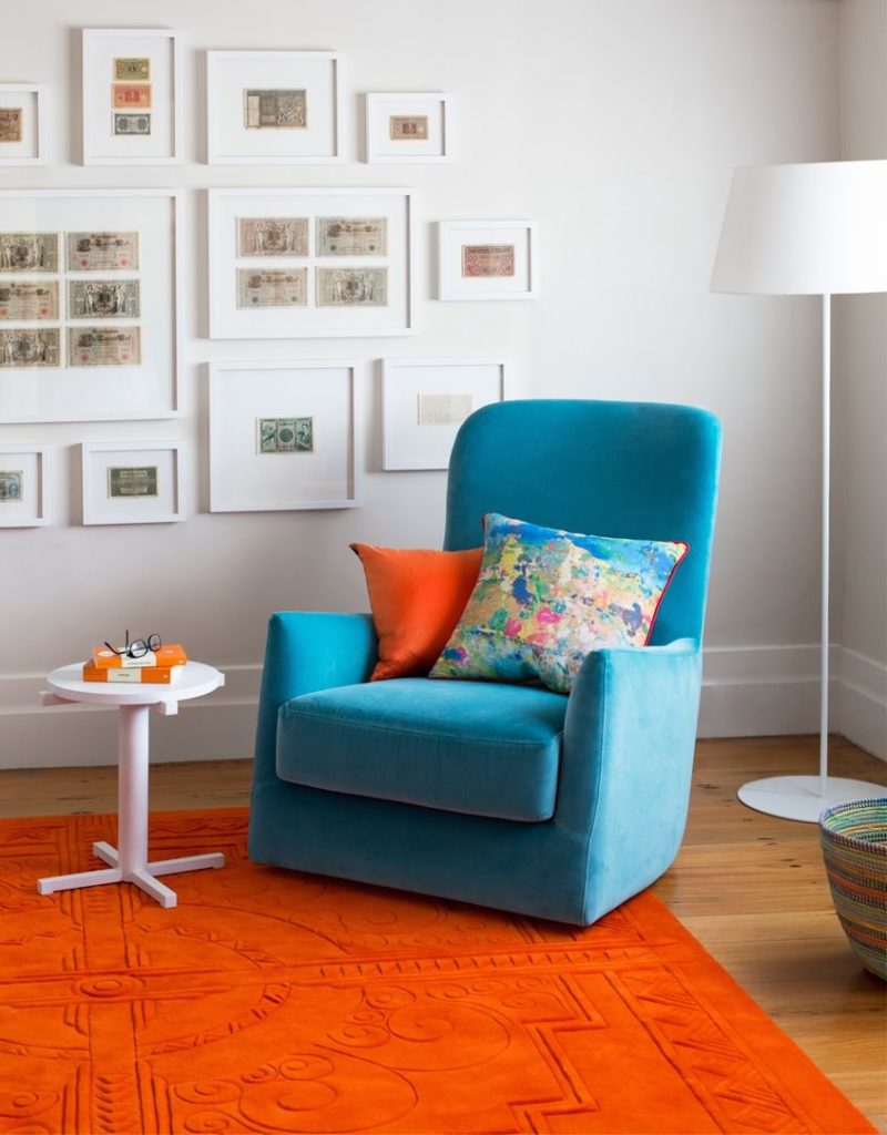
And finally (trust me – I could go on.. but we do need to wrap this up at some point in time…!) in the reading room of our Northcote house, we paired a bright orange cushion -very obviously paired with the floor rug! And for the lil bit of something something that was a bit of different, we printed the fabric for the other cushion! That print comes from an image of a friend of mines art studio. All the paint splashes over the floor looked great with their pattern & colour, so we thought why not!
they looked so good that my artist friend Megan sold a range of them in a shop – they were a sell out apparently!
As I said I bloody love a cushion! I really do see them as a hero detail in the interior & not just fluff!

